


13 years ago
HalloweenFriday, October 29, 2010
In the spirit of Halloween I think it fitting to take a look at the incredible pumpkin carvings of Ray Villafane. This sculptor has worked for both DC Comics and Marvel, so his pumpkin carvings are nothing short of jaw dropping.
I thought this was a great example of ephemeral artwork. We can't help but be reminded of the inevitable decomposition of the materials used in these masterpieces. With ephemeral artwork, it's easy to ask the question of why someone dedicated so much time and effort to something that simply will not last. Pumpkin carving is a tradition, which is a crucial point to make in these pieces. Part of the fun in this tradition is the ephemeral nature of the work. It gives us leave to experiment and grow, knowing that if we make a mistake, it wont haunt us forever.   Taking an activity that is inherently very childlike, and putting skill and experience to use through it is one of the great ways that artists and designers play. Through this kind of enjoyable and relaxing play time, Villafane was able to find his pumpkin carving talents and share them with the world. This artists' already astounding reputation as a sculptor, is leveled when his fans see him 'playing' and doing the very same thing that we all should be doing this Halloween. If I'm not referring specifically to carving pumpkins (which by the way, is something we could all enjoy!), then hear me referring to play itself. Play is what helps cross boundaries in creativity, because in play, there are no boundaries. In play, Villafane doesn't have to worry is the medium for his work will stand the test of time.  Take a look at Ray Villafane's carving techniques and more pictures of his fabulous pumpkins at http://www.villafanestudios.com/pumpkins.htm Form & ContentThursday, October 28, 2010
My Des001 Class watched the film, Objectified today in class. This is a documentary style movie with interviews with designers, clips of the design process, and commentary on design, objects, and consumerism. While this movie is analyzing design as it relates to the objects we use, we were watching and analyzing the movie itself as it relates to design.

This brings to mind the work of Tom Friedman using disposable everyday materials, as well as the ground-breaking conceptual artwork of Duchamp. These artists made their audience look at objects in a new way, they were displayed in such a way that they became something that it wasn't before, and it was important.
This movie has the first impression of being a call for respect for designers, and a portrayal of their crucial role in consumerism, but I think this film's real message and true value to the people who watch it, is to shed light on the fact that we as consumers do deserve to have comfortable, effective, attractive, and well designed objects. After watching this movie, one can recognize that there is no room for these ineffective electronics or uncomfortable attire in society. As a designer, this speaks to me as a warning to be careful about what I'm putting out into the world, and to look for these objects and uses that have no well designed solutions, and do something about it. Even as a consumer, speaking up about painful potato peelers or uncomfortable chairs (to use the film's examples) can make a difference, which is inspiring. Avant-GardeWednesday, October 20, 2010
This overused term puts a bad taste in my mouth. Heard at the most random of times, in the most random of places, why is this term still used? The time in history where this term had any usage and any meaning has passed with the turn of the century. Groundbreaking, rule-breaking, artistic boundary shattering artwork of the 20th century was Avant-Garde. Let's move from this personal vendetta to something rooted in reality.
a vant-gardeLets take a look at some "Avant-Garde" work of the 21st century. Of course, we don't use this outdated term to describe artists who fit into this category anymore, we use the word guerrilla. Guerrilla artists break laws to get their work out there, although they can tend to in creative ways, the lawbreaking is a consistent trend in guerrilla art. Here we find famous names like Banksy and zevs or group organizations like Retna and Wall Spankers who take the only Avant-Garde risks left to take.
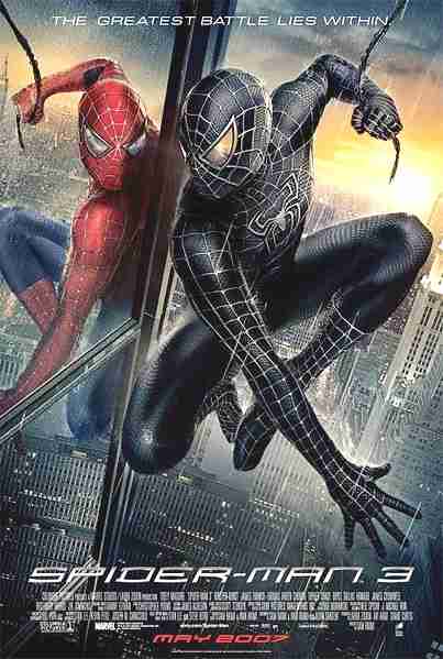
If you are confused as to why criminals are getting artistic recognition, don't worry; you're not alone. Lovers of irony, eat your hearts out.  Comparison and ContrastSunday, October 17, 2010My previous posting entitled Logotypes detailed Gap's recent logo change, and why it was quickly retracted. Logos are one of the most prevalent forms of iconography for us because they are everywhere we go, and have been for centuries. The evolution of logos is a natural thing, and when done right, can help the company enhance their image and reputation. The real question is; why did the company originally try to change their logo so much from the sleek compact style that has made their brand to a long drawn out logo with a typeface ripped of the Spider-Man movie poster? Sony recognized their loss of brand from their decision to change image so suddenly and decided to wedge the PlayStation 3 back in with the classics with an updated version of the same sleek logo. The PlayStation 3 was supposed to be a groundbreaking console, and it was. With capabilities that no other console had before it, they made quite an impression fitting with their brand new logo. But as time progresses, consistency is a priceless advantage that Sony has over many other brands, and it's something not worth losing. Consistency is what makes this company so successful, from the quality of their electronics to their never-changing controller, this brand knows not to fix what isn't broken. Design as ConversationFriday, October 15, 2010
A conversation is a simple concept to grasp, but as applied to design it harder to define it's limitations. Design, like language, is just a medium through which we can communicate. Arguably, design is a language in itself. When we look at designs, there is already an assumption that there is supposed to be an audience or in some cases a client. This would be the design communicating it's piece, to the audience, to the client, but a conversation goes more than one way. What is the audience giving back to the design?
 - photo from Shirley's Blog - One of my favorite performance artists, Yoko Ono, portrays in a more obvious way the conversation between the audience and the artist in almost all of her groundbreaking pieces. In 'Cut Piece', she sat in her best clothes and invited the audience to come and cut pieces of clothing from her. In another famous gallery piece where she met her husband, John Lennon, she invited the audience to hammer a nail into the wall. Artwork like these are inspirational, in that they cross the imaginary boundary between the artist and the world around them. It brings to mind the timeless question of whether the artist is still the artist when they aren't doing the actual creation. Ono's invitations have become classics, and have consistently been revisited over the years.  -photo from MIT Tech - Another amazing piece that Yoko Ono shared was called 'Play it by Trust' and featured a game of chess played with all white pieces on an all white chessboard. At this point, her models are set up in galleries, but this game was intended to be played. Not only a conversation between artist and the world, these pieces make the audience converse with each other.  LogotypesTuesday, October 12, 2010
When working with any kind of iconography change isn't just an inevitability, it's an expectation. The evolution of a corporate logo is under certain constraints that make its alteration quite a delicate and complex process. Logos have been in use for thousands of years, and they have become a regular and welcomed part of our society.
A good logo is ready for change, but the task of actually altering an iconic symbol is still daunting. Iconography has to do with the balance between the timeless quality of symbols and the transformation that they undergo. A successful change takes into consideration the ultimate purpose of the original logo, which involves being easily recognized, remembered, and distinguished. So what drives a company to start from scratch after already putting time and effort into marketing, branding and labeling their logo? As in any style-dependent field, the art of logos is an ephemeral one. Trends transform, technology advances, and, in true iconographic fashion, logos are ready to keep the pace. Companies and consumers alike are enticed by modern or ‘cutting-edge’ styles, and sometimes it feels worth the enormous risk of brand for a simple update.
After successfully branding a company with years or work currently riding on the look of one symbol, that symbol simply must be respected for what it is, an icon. It is easy to refer to language to better understand the importance of a logo. The logo holds a meaning like a word or a letter, and it is crucial that people are able to read and understand that meaning. However poorly executed, the Gap logo does show an obvious attempt to keep the classic blue square in the design, but the essence of the symbol is utterly lost.
As consumers, we have a developed sense of comfort with logos and their evolution. There are certainly boundaries that limit what would be an accepted alteration, but a huge variety of unique logos have been successfully created and updated within those constraints. Further Reading:
Creativity from WithoutSunday, October 10, 2010
Art in any form is often confused with self expression. There is often an assumption that when you're looking at an artist's work, you are peering into their soul. An artist's work is an outer expression of one's feelings, life, opinions, thoughts, emotion, past, or passions; isn't it?
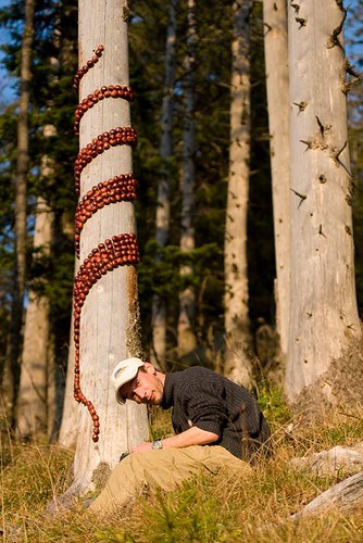
One creative artist, Sylvain Meyer, uses the term 'Land Art' to refer to his work with nature. Meyer's ephemeral designs have earned him quite a bit of recognition, and are reminiscent of the epic natural works of Andy Goldsworthy. The photo to the left shows Meyer in the process of creating one of his noteworthy pieces entitled "Enroulement Marron" or "Brown Swirl" in English. This piece was made out of brown chesnuts, which as Meyer says, are usually only picked up by children. In his works, Meyer is consistently remaining conscious of his effect on the environment around him, and is careful to use "eco-friendly" methods. Meyer's artwork brings to mind the simple play of a child. We all experienced something in the way of making our own mark in nature, whether it be a circle in the sand, a pile of stones, or twisting flowers together into a bracelet. Nature is something we can each relate to being inspired by because it's all around us.      When looking at 'creativity from without', as observers we often find ourselves trying to place meaning on pieces of work that simply isn't meant to be found. The point of work like this isn't to make a statement, boost an opinion, express an emotion, or define the artist. This kind of art is about working with material, enjoying the process, and more often than not, it's about creating something that is simply beautiful. Artwork like Meyer's and Goldworthy's is notable because it represents this type of creation in a natural and stunning way. What makes these artists unique isn't necessarily their talent or skill with their instruments, it is simply their inspiration from without. Graphene ExperimentsThursday, October 7, 2010
Geim and Novoselov were awarded with the Nobel Prize in Physics this year for the successful creation of a substance called graphene. This is essentially a substance of 2 dimensions in a 3 dimensional world. The two prize winners were able to make a sheet of material virtually one atom thick.
The qualities of this material are what make this discovery truly useful. It is a conductor and allegedly stronger than steel. Although this futuristic material itself deserves the creators grand recognition, I think the Nobel Prize may have been awarded to them due to their creativity in their method.  In an interview with Novoselov from the official Nobel Prize website after his nomination, he brought up the simplicity of the concept that led to this creation, these "friday night experiments". " ...we just try to be curious in everything and most important is to have fun. So Andre introduced this habit of Friday evening experiments which ... where you do just crazy things and then some of them sometimes come out, sometimes not. And basically graphene was one of those as well." The New York Times published an article yesterday that delves deeper into this idea of a regular designated period of time allotted for them to just go wild and work on whatever projects they feel drawn to, no matter how strange they seem. "In one of them, Dr. Geim managed to levitate a frog in a magnetic field, for which he won an Ig Nobel — a parody award for “improbable research” — in 2000. On another occasion they produced a “gecko tape” that mimicked the way geckos and Spider-Man can walk on the ceiling." The pair of physicists managed to successfully separate graphene from graphite in a pencil lead using scotch tape to peel off particles of lead, and continue the process until they were left with graphene strips. This approach was so simple, it took the world by surprise. This is a great success story and an example of how just letting go and having fun can lead to the greatest of creations. Design doesn't always come from necessity, sometimes it just comes from a want, a passion, or just plain old curiosity. I have heard of this kind of encouragement to just create for fun on a regular basis. I know that a few companies have instituted this as well, which I think is a fantastic way to promote productivity and innovation (to use the word lightly). This is the workplace of the future, where everyone's ideas are valuable and creative approaches are encouraged wholeheartedly.
Further Reading on Geim and Novoselov and Graphene:
Stone SoupTuesday, October 5, 2010
In Des001 today we visited the concept of Stone Soup. This idea is from an old children's story, which is captured and portrayed wonderfully in Marcia Brown's Stone Soup. The concept was to create out of nothing, and ultimately, to become inspired to use what we could find.
 This is why we started out our Stone Soup with sketches of what we thought we could create. In the end, though, our project came out with a bit of artwork from each of us, and didn't really look like anything we imagined beforehand. Putting the piece together was surprisingly easy. With a group full of designers, we were at no loss when it came to ideas. We had almost too many different materials to work with when we really looked at what we had brought and the trees around us. Deciding to use branches in the piece was the first step, and the branches provided a framework for our other materials.  This act of creating without reason, planning, or stake in the end product reminded us of preschool, and we all had to quiet our minds to create things in pure simplicity. There was no complicating the design with messages, rules, symmetry, coordination or theory; there was only the process. We took the final piece down only minutes after finishing this ephemeral piece of art. This act of creating without reason, planning, or stake in the end product reminded us of preschool, and we all had to quiet our minds to create things in pure simplicity. There was no complicating the design with messages, rules, symmetry, coordination or theory; there was only the process. We took the final piece down only minutes after finishing this ephemeral piece of art.  - 2 photos by Nadja Fitchhorn - The Big PictureMonday, October 4, 2010
When someone says "look at the big picture" there is a visual ideal of taking a step back to see the larger image as a whole. With Design, it isn't so simple. The "big picture" can't be seen by stepping back, but instead by stepping inside, through, and past the original view. It is all about breaking down, analyzing, and asking questions.
 - Portrait of G.A. Escher, M.C. Escher (1935) - - Portrait of G.A. Escher, M.C. Escher (1935) -My Des001 class started by putting an effort into defining design as a concept. The article by Kostas Terzidis, "The Etymology of Design: Pre-Socratic Perspective," (Design Issues Vol. 23, #4, Autumn, 2007: 69-78) delves into the roots of design and other words within it's schema. It is undeniable that design has many meanings, but in breaking down the etymology of the word itself, we can see that it's meanings are quite literally antithetical. By definition design is an approximation (of reality, ideas, life, emotion, etc.) Innovation, as a word pertaining specifically to design in most contexts, is often used synonymously with novelty, but through looking past it's perceived meaning and into the root of the word, we see that innovation is in fact only the appearance of novelty. This literally means innovation applies to things that are not new or original in any way, but are (for whatever reason and in whatever way) viewed as if new. In this way innovation, along with design oppose their own definitions in the way they are used. They can join 'irony', 'peruse', and 'bemused' on the island of consistently misunderstood words. Putting terms like design and innovation into a box with a consistent definition is not what we aim for. The antithetical nature of design itself is reflected in it's lack of definition. Design isn't about 'hitting the nail on the head'; that isn't the goal of a designer. In Michael Bierut's posting entitled "Warning: May Contain Non-Design Content", that box around the term design is questioned, analyzed, and tentatively obliterated. There simply are no limits to what design can be. That isn't to say that there aren't things which are NOT design, however, I would say that there is potential for everything one sees, experiences, knows, or shares to be used within design. Busy Town
Richard Scarry's Busy Town series was a memorable part of my siblings and my childhood. I think playing the Busy Town video game was the first time I really appreciated the design in something that I was using. The colors were so pleasing, so simple, and the user interface just sucked me into the game. I remember playing this game over and over again, and reading the Busy Town books with my brother.
I barely remember anything about the books or the game's plot, but I remember repeatedly going into the world to experience the characters and interact. I remember appreciating the layout of the map for the town. This was definitely one of the first times I even thought about things like that as a child. I noticed the pleasing thick black lines on the animation and the simplistic painterly look of the coloring within them. It mimicked my coloring books, and because of that it all felt very familiar. I know that I recognized this as a child because I don't have to go back and look at the game to remember exactly how the various scenes were pixelated. I remember which one's had a more painterly style and which parts were cell shaded. I noticed that the cats' fur was gradated in some places, and I have the colors and sound effects from the game burned into my memory. These memories of taking my first real look at the way that something was designed for me actually takes me back to the first things that i started using in design. To this day, I find thick lines to be a significant part of my work, and a mix of sharp line work with a watercolor paint is actually something I have been distinguished by. It's interesting to look back and see where my personal values in design may have actually originated. Items of NoteSunday, October 3, 2010
When I think back to objects that made an early impact on me, lamps continue to come up. As early as 6, I was recognizing that light played a huge role in how much I enjoyed my surroundings.
One lamp that I had when I was 7 (and kept until I started high-school) was one of those artsy spider-like bouquet floor lamps (similar to the picture below, although mine had six lights, and they were all in white). The stems were extremely malleable, so you could bend the lights in every which way. In fact, I often did change the lamp’s appearance. I was obsessed with redecorating and re-arranging. The lamp tended to fit in a corner, where I would either direct the lights outward and toward the wall to make an epic spidery effect, or keep some bending down to highlight things like a collection of dolls or my child sized drum set.  - photo from Home Decor - - photo from Home Decor - This lamp had a shiny silver metallic stand, and cone shaped shades over halogen-bright bulbs. It gave my room the feel of a gallery or an art showroom. The shades were matte and pure white. At the time for me, this lamp was the very essence of design; it screamed cutting-edge and 'modern art'. This lamp was something that I can remember every part of, because it was one of the first pieces that I owned that made me really look at the design of the things around me. Because it was so customizable, I got to play a part in the overall look of the lamp and the light that is created. This made me think about and put effort into design in a way that I hadn't before. To me, it is meaningful that I can remember this lamp so well. We all have objects that we will never forget, because they defined who we are or were at the time. Feeling like an object is an extension of us is part of why consumerism prevails. It is enjoyable to attach ourselves to objects and to add them to our family. Giving up that lamp was actually hard for me to do when the time came. It is worth noting that the way our attachments to objects can grow over time directly opposes our need to continuously dispose of objects as they wear out, break, or become outdated. Designer
As a child, choosing what we want to do for a living seems like a most crucial and time-sensitive decision. I remember just knowing that everyone in my third grade class already knew exactly what they wanted to be when they grew up, and were already working towards their goals. I was behind. I never felt like I knew what I wanted to do for a living. What I knew was that I was fascinated by things that made me feel intensely, and had some kind of unusual draw towards dramatic situations. Since I was 7, I have gone through many passions, but they always change, and I always get bored. Choosing to major in design was not an easy decision for me to arrive at, in fact, it's one that I chose in the last few days of registration. This isn't the first time that having a deadline to make has eased the decision making process a bit. Although I was rushed, I know that design was the right choice for me personally, not only because of future goals, but also by looking back at what I enjoyed and found interesting when I was young.
When I think about design as a career choice, I still find myself thinking that it's best suited for someone who has a passion for creating new things. That isn't my experience. Personally, I do not consider myself a creator, or even one who is passionate about the idea that we can create new things. What I'm really passionate about is being inspired. Seeing new things makes me excited, and it always has. It is enjoyable and effortless to soak up style, technique, mood, and composition of new artwork that I see, but also by structures and objects I find as I move through the world. Being in a new place in the way that novels, video games, movies, and travel can offer is absolutely a source of inspiration to me. That truly encompasses what being a designer is about for me personally. Designers are just pros at being inspired. Design In SocietySaturday, October 2, 2010
Since the term "design" is one of the many English words that has no true and agreed upon meaning, the topic of "design in society" is an intensely broad one. In our world, we can witness design in several ways that are immediately recognizable; things like architecture, fashion, websites, jewelry, and other objects we use in our lives and consider to be of artistic or creative value. There is also the less recognizable design, the objects that aren't considered of any large scale artistic value, but are designed to make life easier.
For my sake, I am limiting design to what I'd consider to be successes in society. This doesn't necessarily mean only objects and designs that have been recognized by society to be of merit, but also designs that I personally recognize as having potential to add value to our world.  - photo from Lauren's Blog - If design was a cupcake, art would be the frosting. Art in itself is something difficult to define as well, but there is no disputing that art and design overlap in a major way. To me, design also seems to envelope a large mass of things that are not considered art. For some people, the terms 'design' and 'art' are entirely interchangeable, but for the sake of getting a closer hold on the meaning of design, I am limiting art to aesthetics, where i find design to be rooted much more in reality, in that it can be found in things that cannot be seen. Sometimes the definitions aren't important. Most of us can tell when something is or is NOT design related, but I might argue that everything has the potential to be used in design. To me, design (loosely) is the process of taking from x to idealize y. In terms of design in society, this relates to almost everything that we do, regardless of the field. Creation is part of humanity, and to create we first have to imagine it into existence. That is where I see design, right in between seeing something new and having created something new.
Subscribe to:
Posts (Atom)
About Me
Featured Blogs
|