


14 years ago
Design is Dangerous - AdvertisingMonday, November 29, 2010
Is advertising really harmful? This question may have been up to debate a few decades ago but at this point, it's relatively agreed on that advertising has a very powerful effect on the way we think. As designers, we have an obligation to apply a certain ethic and moral principle to our work. The allure is that advertising is a very lucrative business to be in right now, and there's nothing wrong with marketing, but it's crucial to be aware of the impact that our designs are making on the world.
 Ads are everywhere and we may feel like we can tune them out but the fact is, these images are carefully designed to get through to you. No one is above it. The advertisement shown here is for a credit card, something that we all know how to get without being reminded of how easy it is. Credit companies find new ways to try to trick us into debt faster and faster. Most credit card companies have "exclusive" cards for an annual fee, catering to the elite (or those who wish they were 'elite'). Ads are everywhere and we may feel like we can tune them out but the fact is, these images are carefully designed to get through to you. No one is above it. The advertisement shown here is for a credit card, something that we all know how to get without being reminded of how easy it is. Credit companies find new ways to try to trick us into debt faster and faster. Most credit card companies have "exclusive" cards for an annual fee, catering to the elite (or those who wish they were 'elite').What kind of effect do all these loan and credit advertisements have on children? Children are exposed to so many advertisements that it is necessary to consider how ads impact their lives. Designers need to look at ads through a child's eyes as well as their target market because children soak up everything they see like a sponge. How can it be morally ethical to train a child through bombarding them with advertisements that having a credit card makes you elite? or that taking out a loan is a simple thing to do? Utopian Design in Society
Many companies have turned to sustainable design as the hot button of environmental disaster grows ever larger. Renault is a company that sees the need for a "green" car that can still perform well as an invitation to expand. They plan to launch a new version of their "Zoe" model as a performance version.
   Color Transforms
Color theory is about a-lot more than the color wheel we learned in first grade. In high-school art classes kids are often taught about color mixing with pigments, but beyond how to mix paint, what do we need to know about colors that isn't already obvious?
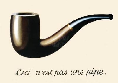
Rene Magritte's famous work "The Treason of Images" touches on how image can deceive. Color in this same way has the ability to trick the eye. The optical illusion below gives a simplistic hint at the potential color has in tricking the mind. The two labeled squares are actually the same color but they don't appear to be the same at all because of the context of the image.  Beyond context, color actually has the ability to change the way that other colors around it appear. A bright color surrounded by muted and unsaturated tones will pop out. Artists can utilize these tricks of color to convey a message. Making this kind of emphasis can really grab attention and say something to the viewer. Natural Works
The work of Richard Long has long been a source of inspiration for designers in every field. His ephemeral installations are signature and easily recognizable, as they have an elegance that can only come from a great designer, while still maintaining a natural element.
Richard Long is probably best known for his arrangements of natural materials like stone, slate; although his mud paintings are equally stunning and notable. Sometimes meaning is given to these projects and installations, but for the most part, these are just simple beauty in pure design.
Infographics
Here is an interesting and currently ongoing project by artist Roman Ondák. "Taking place" is a temporal work existing an interior gallery space. Each visitor to the gallery room has an opportunity to have their name recorded at their height, along with the date. The concept is the slow formation of a black line at the average height. The only names that are at all legible after a while are the names of those who are true outliers. This project is 'taking place' at the temporary stedelijk until January 9, 2011.
  
This piece was not created by the artist, bringing up once again the ever present question of 'what is art', but the design of the infographic itself is art. The concept is a new convenient way of recording data that is designed in such a way that the mean becomes obvious and the outliers become known. This installation is actually a current rendering of this concept. It was previously presented at MoMa in 2007 under the title "Measuring the Universe". Roman Ondák's gained notoriety in the world of art and design from this concept, and has become quite a name to know. A Designer's ResumeMonday, November 15, 2010
Resume's aren't a topic of much interest. We all learned how to create a resume from a business class or relative, and pretty much took for granted that it's just the way things are. As artists and designers, when we apply for job positions, we aren't just sending employers a resume. We also include our painstaking ever-improving portfolio, but is it enough?
A resume is a place to display our skills, and as designers (especially designers in visual communication fields) shouldn't our resume be a tribute to our style and creativity as well? We take on this initiative often with business cards and websites, but in our resumes we very well can go to all the same extremes to make an impression. These are some designers who took an extra step in being remembered, and shared their resume's to inspire and push the boundaries of our presentation in everyday life. It's fun to look through and see the unique and creative ways some artists have found to make themselves known; and what an exciting thought that we could all be this creative in the way that piece of paper or PDF document we send out to those judgmental employers and have that document really represent who we are.
The way we present ourselves to society is constantly under scrutiny, and we feel this. There are so many little ways like this that we can make impressions, improve our image, and be remembered as designers. It might be time for even those outside of the artistic field to start getting bold with their resumes. Motorola's Droid X
The Droid X is Motorola's contribution to Verizon's line of Android phones, the Droids. To get through the basics, this phone features an enormous touch screen display along with buttons on the front face. I will try not to dwell on comparisons but the Droid's natural competitor would have to be Apple's iPhone (it's smart to keep things like this in mind), but if you're interested, there are nice simple comparison charts all over the web.
 The specs for a phone like this aren't as important as the overall feel of this phone in utilization.The user interface is simple to use, and very well designed. It is easy for a first time user to figure out how to use the phone features, the texting, or the browser. Anyone who is already familiar with the structure of a PC's user interface can also easily alter settings, play music, install applications, and save, alter and transfer documents. This phone does definitely appeal to users who have the background knowledge that using a Windows OS provides, and caters to the customize-ability that we Microsoft fans have become accustomed to. Using the keyboard is something that I was worried about (being new to touch screen keyboards), but I found it to be simple and efficient, even without turning the screen horizontally for larger keys. The phone is comfortable to hold, even while making calls, which was somewhat unexpected due to it's bulky rectangular appearance. The speaker is of great quality and is loud enough to hear and use at a comfortable distance while using the speakerphone feature. As far as performance goes, this phone is a beast. There are many productivity oriented applications, but I have found the most useful to be the Google Maps navigator, the calendar, and the clock. The navigator was well thought out. The iPhone also uses the Google Maps system, but isn't so well linked to an effective navigation program. The Droid X comes with Google Maps preinstalled (like the iPhone), and is linked to the phone's preinstalled navigation software. This truly allows users to use this phone as a GPS while driving directly from Google Maps, instead of having the classic step by step instructions (and having to click the next button each step of the way).  A few negative notes; the camera is an impressive 8mp camera at the back of the phone. This is one of the most useless features of this device, and it's boasted as one of it's best. The camera application takes almost 5 seconds to load up, and the button to take a picture is so hard to press all the way down that more than half the time, it turns out that the photo was not taken. It also would have been unbelievably useful for the designers to think about how far programs like Facetime and Skype have gone, and put a camera on the front of the phone. I would have easily chosen to give up the 8mp and HD video for a crappy camera that I could use for video chat. The battery that came with the phone is also very unimpressive. Verizon offers an extended battery at an (enormous) extra cost, but its worth the money only because the phone is practically unusable (with just about 6 hours minimum usage) with the original battery. A phone should come prepared with a good battery in the packaging; this one just wasn't up to par. This phone is alot of fun to use and it's customize-ability and simple file transfer system has won my heart. When people buy a phone today though, we aren't looking for something that's going to last forever, or that we could see ourselves with even in 5 years. The safety that consumers crave from buying these kind of devices has to do with whether it's worth the money. This phone is definitely pricey, at about $360 without a service plan at this point. This phone was well worth it for someone who values being able to customize all aspects of their phone and not have to worry about jailbreaking an iPhone and any repercussions of doing so. I wouldn't reccomend this to users over 40, as most of the features are exciting because they appeal perfectly to their market; college students. Brian FiesThursday, November 4, 2010
Tuesday we had a guest speaker in my Des001 class to talk to us about the design process of a working comic book artist. We heard a wonderful presentation from Brian Fies, the artist who created Mom's Cancer and Whatever Happened to the World of Tomorrow. It was incredible to hear from someone working in such an artistic field, and after hearing about his books, I immediately wanted to run out and buy them.
 Brian Fies walked us through his own personal creative process while making these comics. He started out slowly by taking us through his character designs for Mom's Cancer. Because this book's concept was drawn from life, his characters already existed in life and it was up to him to turn them into comics. In contrast, his character designs for WHttWoT were based not on life, but were created from his head. Because of this, Brian Fies put alot of thought into the appearance of the main characters in the story and their alter personae. We were able to see some of the inspiration for the sci-fi action heroes' costumes and his well thought out decisions around some of the major differences between the two characters. The process of character creation is something I haven't delved into much, but this presentation was inspiring to me. The level of detail and thought put into each artistic decision is just epic. I look forward to reading Brian Fies work. HalloweenFriday, October 29, 2010
In the spirit of Halloween I think it fitting to take a look at the incredible pumpkin carvings of Ray Villafane. This sculptor has worked for both DC Comics and Marvel, so his pumpkin carvings are nothing short of jaw dropping.
I thought this was a great example of ephemeral artwork. We can't help but be reminded of the inevitable decomposition of the materials used in these masterpieces. With ephemeral artwork, it's easy to ask the question of why someone dedicated so much time and effort to something that simply will not last. Pumpkin carving is a tradition, which is a crucial point to make in these pieces. Part of the fun in this tradition is the ephemeral nature of the work. It gives us leave to experiment and grow, knowing that if we make a mistake, it wont haunt us forever.   Taking an activity that is inherently very childlike, and putting skill and experience to use through it is one of the great ways that artists and designers play. Through this kind of enjoyable and relaxing play time, Villafane was able to find his pumpkin carving talents and share them with the world. This artists' already astounding reputation as a sculptor, is leveled when his fans see him 'playing' and doing the very same thing that we all should be doing this Halloween. If I'm not referring specifically to carving pumpkins (which by the way, is something we could all enjoy!), then hear me referring to play itself. Play is what helps cross boundaries in creativity, because in play, there are no boundaries. In play, Villafane doesn't have to worry is the medium for his work will stand the test of time.  Take a look at Ray Villafane's carving techniques and more pictures of his fabulous pumpkins at http://www.villafanestudios.com/pumpkins.htm Form & ContentThursday, October 28, 2010
My Des001 Class watched the film, Objectified today in class. This is a documentary style movie with interviews with designers, clips of the design process, and commentary on design, objects, and consumerism. While this movie is analyzing design as it relates to the objects we use, we were watching and analyzing the movie itself as it relates to design.

This brings to mind the work of Tom Friedman using disposable everyday materials, as well as the ground-breaking conceptual artwork of Duchamp. These artists made their audience look at objects in a new way, they were displayed in such a way that they became something that it wasn't before, and it was important.
This movie has the first impression of being a call for respect for designers, and a portrayal of their crucial role in consumerism, but I think this film's real message and true value to the people who watch it, is to shed light on the fact that we as consumers do deserve to have comfortable, effective, attractive, and well designed objects. After watching this movie, one can recognize that there is no room for these ineffective electronics or uncomfortable attire in society. As a designer, this speaks to me as a warning to be careful about what I'm putting out into the world, and to look for these objects and uses that have no well designed solutions, and do something about it. Even as a consumer, speaking up about painful potato peelers or uncomfortable chairs (to use the film's examples) can make a difference, which is inspiring. Avant-GardeWednesday, October 20, 2010
This overused term puts a bad taste in my mouth. Heard at the most random of times, in the most random of places, why is this term still used? The time in history where this term had any usage and any meaning has passed with the turn of the century. Groundbreaking, rule-breaking, artistic boundary shattering artwork of the 20th century was Avant-Garde. Let's move from this personal vendetta to something rooted in reality.
a vant-gardeLets take a look at some "Avant-Garde" work of the 21st century. Of course, we don't use this outdated term to describe artists who fit into this category anymore, we use the word guerrilla. Guerrilla artists break laws to get their work out there, although they can tend to in creative ways, the lawbreaking is a consistent trend in guerrilla art. Here we find famous names like Banksy and zevs or group organizations like Retna and Wall Spankers who take the only Avant-Garde risks left to take.
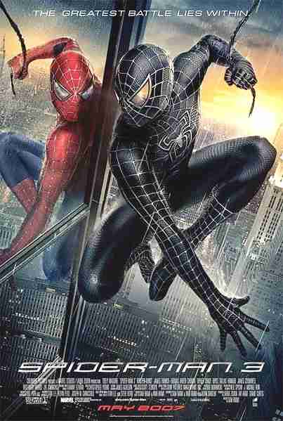
If you are confused as to why criminals are getting artistic recognition, don't worry; you're not alone. Lovers of irony, eat your hearts out.  Comparison and ContrastSunday, October 17, 2010My previous posting entitled Logotypes detailed Gap's recent logo change, and why it was quickly retracted. Logos are one of the most prevalent forms of iconography for us because they are everywhere we go, and have been for centuries. The evolution of logos is a natural thing, and when done right, can help the company enhance their image and reputation. The real question is; why did the company originally try to change their logo so much from the sleek compact style that has made their brand to a long drawn out logo with a typeface ripped of the Spider-Man movie poster? Sony recognized their loss of brand from their decision to change image so suddenly and decided to wedge the PlayStation 3 back in with the classics with an updated version of the same sleek logo. The PlayStation 3 was supposed to be a groundbreaking console, and it was. With capabilities that no other console had before it, they made quite an impression fitting with their brand new logo. But as time progresses, consistency is a priceless advantage that Sony has over many other brands, and it's something not worth losing. Consistency is what makes this company so successful, from the quality of their electronics to their never-changing controller, this brand knows not to fix what isn't broken. Design as ConversationFriday, October 15, 2010
A conversation is a simple concept to grasp, but as applied to design it harder to define it's limitations. Design, like language, is just a medium through which we can communicate. Arguably, design is a language in itself. When we look at designs, there is already an assumption that there is supposed to be an audience or in some cases a client. This would be the design communicating it's piece, to the audience, to the client, but a conversation goes more than one way. What is the audience giving back to the design?
 - photo from Shirley's Blog - One of my favorite performance artists, Yoko Ono, portrays in a more obvious way the conversation between the audience and the artist in almost all of her groundbreaking pieces. In 'Cut Piece', she sat in her best clothes and invited the audience to come and cut pieces of clothing from her. In another famous gallery piece where she met her husband, John Lennon, she invited the audience to hammer a nail into the wall. Artwork like these are inspirational, in that they cross the imaginary boundary between the artist and the world around them. It brings to mind the timeless question of whether the artist is still the artist when they aren't doing the actual creation. Ono's invitations have become classics, and have consistently been revisited over the years.  -photo from MIT Tech - Another amazing piece that Yoko Ono shared was called 'Play it by Trust' and featured a game of chess played with all white pieces on an all white chessboard. At this point, her models are set up in galleries, but this game was intended to be played. Not only a conversation between artist and the world, these pieces make the audience converse with each other.  LogotypesTuesday, October 12, 2010
When working with any kind of iconography change isn't just an inevitability, it's an expectation. The evolution of a corporate logo is under certain constraints that make its alteration quite a delicate and complex process. Logos have been in use for thousands of years, and they have become a regular and welcomed part of our society.
A good logo is ready for change, but the task of actually altering an iconic symbol is still daunting. Iconography has to do with the balance between the timeless quality of symbols and the transformation that they undergo. A successful change takes into consideration the ultimate purpose of the original logo, which involves being easily recognized, remembered, and distinguished. So what drives a company to start from scratch after already putting time and effort into marketing, branding and labeling their logo? As in any style-dependent field, the art of logos is an ephemeral one. Trends transform, technology advances, and, in true iconographic fashion, logos are ready to keep the pace. Companies and consumers alike are enticed by modern or ‘cutting-edge’ styles, and sometimes it feels worth the enormous risk of brand for a simple update.
After successfully branding a company with years or work currently riding on the look of one symbol, that symbol simply must be respected for what it is, an icon. It is easy to refer to language to better understand the importance of a logo. The logo holds a meaning like a word or a letter, and it is crucial that people are able to read and understand that meaning. However poorly executed, the Gap logo does show an obvious attempt to keep the classic blue square in the design, but the essence of the symbol is utterly lost.
As consumers, we have a developed sense of comfort with logos and their evolution. There are certainly boundaries that limit what would be an accepted alteration, but a huge variety of unique logos have been successfully created and updated within those constraints. Further Reading:
Creativity from WithoutSunday, October 10, 2010
Art in any form is often confused with self expression. There is often an assumption that when you're looking at an artist's work, you are peering into their soul. An artist's work is an outer expression of one's feelings, life, opinions, thoughts, emotion, past, or passions; isn't it?
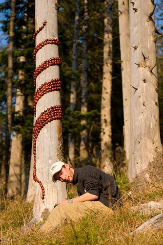
One creative artist, Sylvain Meyer, uses the term 'Land Art' to refer to his work with nature. Meyer's ephemeral designs have earned him quite a bit of recognition, and are reminiscent of the epic natural works of Andy Goldsworthy. The photo to the left shows Meyer in the process of creating one of his noteworthy pieces entitled "Enroulement Marron" or "Brown Swirl" in English. This piece was made out of brown chesnuts, which as Meyer says, are usually only picked up by children. In his works, Meyer is consistently remaining conscious of his effect on the environment around him, and is careful to use "eco-friendly" methods. Meyer's artwork brings to mind the simple play of a child. We all experienced something in the way of making our own mark in nature, whether it be a circle in the sand, a pile of stones, or twisting flowers together into a bracelet. Nature is something we can each relate to being inspired by because it's all around us.      When looking at 'creativity from without', as observers we often find ourselves trying to place meaning on pieces of work that simply isn't meant to be found. The point of work like this isn't to make a statement, boost an opinion, express an emotion, or define the artist. This kind of art is about working with material, enjoying the process, and more often than not, it's about creating something that is simply beautiful. Artwork like Meyer's and Goldworthy's is notable because it represents this type of creation in a natural and stunning way. What makes these artists unique isn't necessarily their talent or skill with their instruments, it is simply their inspiration from without. Graphene ExperimentsThursday, October 7, 2010
Geim and Novoselov were awarded with the Nobel Prize in Physics this year for the successful creation of a substance called graphene. This is essentially a substance of 2 dimensions in a 3 dimensional world. The two prize winners were able to make a sheet of material virtually one atom thick.
The qualities of this material are what make this discovery truly useful. It is a conductor and allegedly stronger than steel. Although this futuristic material itself deserves the creators grand recognition, I think the Nobel Prize may have been awarded to them due to their creativity in their method.  In an interview with Novoselov from the official Nobel Prize website after his nomination, he brought up the simplicity of the concept that led to this creation, these "friday night experiments". " ...we just try to be curious in everything and most important is to have fun. So Andre introduced this habit of Friday evening experiments which ... where you do just crazy things and then some of them sometimes come out, sometimes not. And basically graphene was one of those as well." The New York Times published an article yesterday that delves deeper into this idea of a regular designated period of time allotted for them to just go wild and work on whatever projects they feel drawn to, no matter how strange they seem. "In one of them, Dr. Geim managed to levitate a frog in a magnetic field, for which he won an Ig Nobel — a parody award for “improbable research” — in 2000. On another occasion they produced a “gecko tape” that mimicked the way geckos and Spider-Man can walk on the ceiling." The pair of physicists managed to successfully separate graphene from graphite in a pencil lead using scotch tape to peel off particles of lead, and continue the process until they were left with graphene strips. This approach was so simple, it took the world by surprise. This is a great success story and an example of how just letting go and having fun can lead to the greatest of creations. Design doesn't always come from necessity, sometimes it just comes from a want, a passion, or just plain old curiosity. I have heard of this kind of encouragement to just create for fun on a regular basis. I know that a few companies have instituted this as well, which I think is a fantastic way to promote productivity and innovation (to use the word lightly). This is the workplace of the future, where everyone's ideas are valuable and creative approaches are encouraged wholeheartedly.
Further Reading on Geim and Novoselov and Graphene:
Stone SoupTuesday, October 5, 2010
In Des001 today we visited the concept of Stone Soup. This idea is from an old children's story, which is captured and portrayed wonderfully in Marcia Brown's Stone Soup. The concept was to create out of nothing, and ultimately, to become inspired to use what we could find.
 This is why we started out our Stone Soup with sketches of what we thought we could create. In the end, though, our project came out with a bit of artwork from each of us, and didn't really look like anything we imagined beforehand. Putting the piece together was surprisingly easy. With a group full of designers, we were at no loss when it came to ideas. We had almost too many different materials to work with when we really looked at what we had brought and the trees around us. Deciding to use branches in the piece was the first step, and the branches provided a framework for our other materials.  This act of creating without reason, planning, or stake in the end product reminded us of preschool, and we all had to quiet our minds to create things in pure simplicity. There was no complicating the design with messages, rules, symmetry, coordination or theory; there was only the process. We took the final piece down only minutes after finishing this ephemeral piece of art. This act of creating without reason, planning, or stake in the end product reminded us of preschool, and we all had to quiet our minds to create things in pure simplicity. There was no complicating the design with messages, rules, symmetry, coordination or theory; there was only the process. We took the final piece down only minutes after finishing this ephemeral piece of art.  - 2 photos by Nadja Fitchhorn -
Subscribe to:
Posts (Atom)
About Me
Featured Blogs
|