



15 years ago
|
Showing posts with label Logo. Show all posts
Showing posts with label Logo. Show all posts
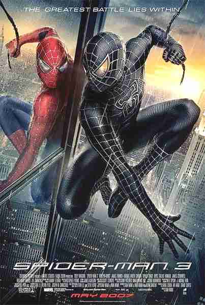
Comparison and ContrastSunday, October 17, 2010My previous posting entitled Logotypes detailed Gap's recent logo change, and why it was quickly retracted. Logos are one of the most prevalent forms of iconography for us because they are everywhere we go, and have been for centuries. The evolution of logos is a natural thing, and when done right, can help the company enhance their image and reputation.  The real question is; why did the company originally try to change their logo so much from the sleek compact style that has made their brand to a long drawn out logo with a typeface ripped of the Spider-Man movie poster? Sony recognized their loss of brand from their decision to change image so suddenly and decided to wedge the PlayStation 3 back in with the classics with an updated version of the same sleek logo.  The PlayStation 3 was supposed to be a groundbreaking console, and it was. With capabilities that no other console had before it, they made quite an impression fitting with their brand new logo. But as time progresses, consistency is a priceless advantage that Sony has over many other brands, and it's something not worth losing. Consistency is what makes this company so successful, from the quality of their electronics to their never-changing controller, this brand knows not to fix what isn't broken. LogotypesTuesday, October 12, 2010
When working with any kind of iconography change isn't just an inevitability, it's an expectation. The evolution of a corporate logo is under certain constraints that make its alteration quite a delicate and complex process. Logos have been in use for thousands of years, and they have become a regular and welcomed part of our society.
A good logo is ready for change, but the task of actually altering an iconic symbol is still daunting. Iconography has to do with the balance between the timeless quality of symbols and the transformation that they undergo. A successful change takes into consideration the ultimate purpose of the original logo, which involves being easily recognized, remembered, and distinguished. So what drives a company to start from scratch after already putting time and effort into marketing, branding and labeling their logo? As in any style-dependent field, the art of logos is an ephemeral one. Trends transform, technology advances, and, in true iconographic fashion, logos are ready to keep the pace. Companies and consumers alike are enticed by modern or ‘cutting-edge’ styles, and sometimes it feels worth the enormous risk of brand for a simple update.
After successfully branding a company with years or work currently riding on the look of one symbol, that symbol simply must be respected for what it is, an icon. It is easy to refer to language to better understand the importance of a logo. The logo holds a meaning like a word or a letter, and it is crucial that people are able to read and understand that meaning. However poorly executed, the Gap logo does show an obvious attempt to keep the classic blue square in the design, but the essence of the symbol is utterly lost.
As consumers, we have a developed sense of comfort with logos and their evolution. There are certainly boundaries that limit what would be an accepted alteration, but a huge variety of unique logos have been successfully created and updated within those constraints. Further Reading:
Subscribe to:
Posts (Atom)
About Me

Featured Blogs
|